Roskruish and okhrenie are two terms a student of icons should know. They signify two steps in the painting of Russian icons.
Roskruish (роскрыш– also transliterated roskrysh) is the application of the flat, often dark base colors to the image.
Once the roskruish is completed, then the okhrenie (охрение) begins. Okhrenie is the application of lighter colors to the dark base color of the “flesh” areas (face, hands, etc.). It is essentially the process that creates the features of the face in paint, rather than just the preliminary drawing or pattern drawn or scratched into the surface of the icon panel (it was very common for Russian icons to have the outline of the pattern scratched into the levkas (gesso) surface of the wooden panel).
Here is the roskruish of the Igorevskaya icon:
And here is the okhrenie:
These videos use the plav’ technique, in which the colors seem to melt into one another, rather than the otborka technique, which uses fine but clearly separate strokes of paint to lighten the dark background color and thus bring out features and highlights.
Having told of the preparation of the wooden icon panel, today I would like to talk a bit about the actual painting of an icon. I will not go into great detail, because my purpose is not to tell artists how to paint icons, but rather to give those interested in icons the necessary background to understand how they are made.
To make things simple, we can use the way in which an icon was often painted in the 19th century. It began with a pattern, either a description of a saint in a podlinnik — a manual that told painters the appropriate garments, hair, shape of beard, objects held, scroll (when appropriate) and title for each saint — or else an actual pattern. Such a pattern was often made from an existing icon by following over its outlines with a fine brush dipped in a sticky substance such as tinted garlic juice or honey. A piece of paper was pressed over the surface, and the sticky substance formed the outlines of the icon on the paper.
Those outlines were then gone over with needle pricks to make holes in the paper following the outlines. This created the icon pattern, which one could then put over the smooth levkas (gesso) surface of the prepared icon panel. Powdered charcoal in a little bag was then pounced lightly over the surface of the paper pattern, and its fine dust went through the needle pricks and onto the gesso surface of the panel.
The final step in transferring the pattern to the icon panel was to scratch the outline of the transferred pattern into the levkas (gesso) surface with a sharp tool called a графья/graf’ya, marking it permanently with the outlines (the графьи/graf’i) of the icon to be painted. Once that was done, the actual painting could begin. These needle-incised outlines in the gesso are commonly still visible when one looks closely at the painted surface of such an icon.
To understand the sequence of painting, it is helpful to ponder a different kind of icon for a moment, those painted as folk objects in Romania on the reverse side of a pane of glass. To paint such an icon, one had to do it in reverse, first painting, for example, the light highlights of a saint’s face, and then working backward to the base colors.
Russian icon painting on panels, by contrast, began with a brownish base color for a saint’s face and exposed body parts. This brownish color was called the sankir. The Greeks often preferred it to have a slightly more greenish-olive tinge. Then successive layers of lighter colors of ochre paint were superimposed over the brown to dark brown sankir to bring out the forms and highlights of the face, etc. This process of adding progressively lighter layers over one another is called vokhrenie or okhrenie, or in rough English, “ochering.”
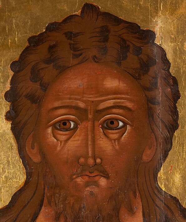
If we look at this detail from an icon of John the Forerunner (John the Baptist), we can see clearly how the entire surface of the face was first painted with a brown sankir. Then the features of the face were moulded by adding progressively lighter layers over that, leaving the darker color visible here and there. So icons were painted in a system of layered colors, with lighter colors superimposed over darker colors, finishing with increasingly white touches. The exceptions here to this are the eyebrows, which are in an even darker brown than the base color, as well as the dark strokes used to detail the hair, as well as elsewhere to finish the image. Note that the base color of the hair and beard are exactly the same brown base color used for the face.
(Courtesy of Jacksonsauction.com)
A light layer could be added in separate thin, clear strokes to model the facial features, a technique called OTBORKA (Отборка), literally “picking,” or the paint strokes, instead of being clearly separate, could be more liquid and “melt” into one another, a technique called PLAV’ (Плавь), “melted.” “Picking” was the more traditional of the two methods, used for non-realistic “abstract” painting, and “melting” worked better for western-influenced, more realistic icons. The last steps involved the adding of the lightest colors, as well as delineating fine features, and, of course, in more expensive icons, the addition of gold leaf highlights in garments, etc.
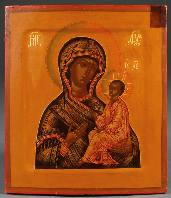
In the icon of the “Tikhvin” Mother of God shown above, one can easily see that Mary’s facial features are formed by superimposing lighter shades over the dark brownish base color so obvious in her right cheek. The same is seen in the Christ Child’s (Christ Immanuel) face. So the painting of icons was essentially the forming of facial features by superimposing progressively lighter and lighter highlights over a dark background base color. (The dark strip at upper right is a remnant of the original olifa varnish).
(Courtesy of Jacksonsauction.com)
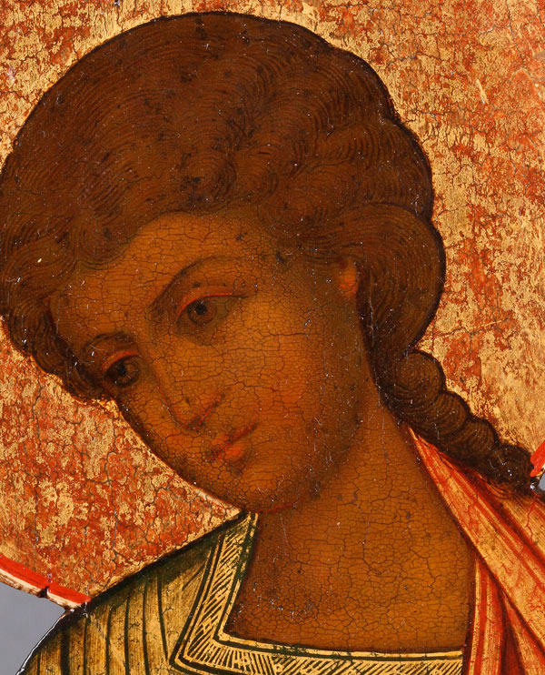
In the icon of St. John (Ioann) seen above, the painter used a more sophisticated and nuanced method of layering from dark to light, not nearly so abrupt and obvious. Nonetheless, the basic method of lighter layers over darker is still there, used even in delineating the hairs of the head.
(Courtesy of Jacksonsauction.com)
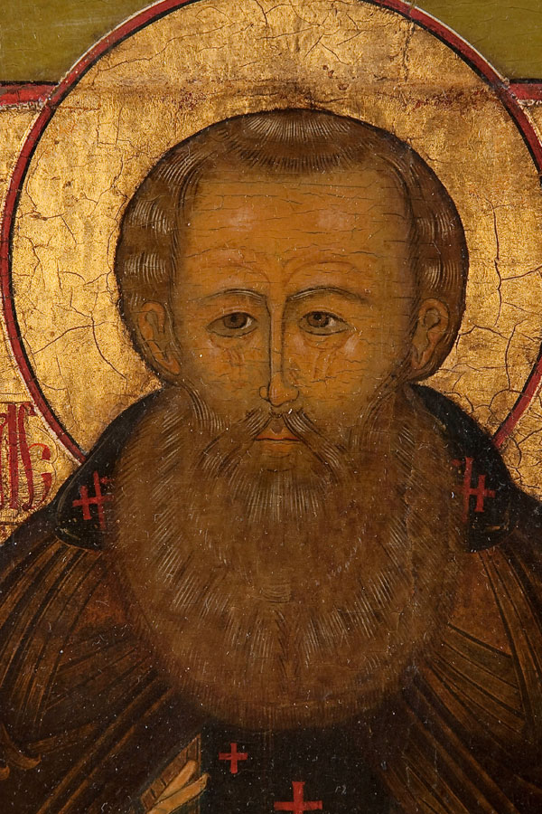
If you look carefully at the facial detail from an icon of St. Alexander Svirskiy, shown above, you can see that everything from his wide, long beard to the hair on his head to his face all has the same underlying dark brownish sankir color. A slightly lighter brownish layer was then overlaid on that in the beard and hair regions, and then “hair” detailing was added to both areas, largely in narrow streaks of white paint. The dark sankir background of the face has a more complex layering of lighter and lighter shades of brown superimposed on one another, finally finished off with the last detailing in whitish highlights and very black outlining in nose and eyebrows, etc.
I have often thought that because of this characteristic layering of shades of paint in icons, it would be very easy to reproduce the stylized manner of icon making if one used silk screen printing, using a separate screen for the different layers. Obviously, that idea occurred to others as well, because there are now many shops selling silk-screened icons online, some of them quite well made, and at a fraction of the cost of hand-painted icons.
In icon studios, the faces and hands of saints were generally painted last, by the studio’s best painter or painters. The garments and other background features were commonly the first, painted in by others. In an icon studio one would see unfinished icons set aside and drying, backgrounds and garments without hands or faces, waiting for the “face painter” to do his job. So the painting of icons was often a communal project, with different tasks performed by different people. That is because a studio had to streamline its production to keep up with the demand for icons, and also to keep costs down.
There were also icon painters who worked alone and painted the whole icon — faces, garments, and backgrounds.
Because no podlinnik (painter’s manual), whether plain text or illustrated, included all the icon types one might be called upon to supply, icon studios often had their own collections of prorisi (singular proris), which were tracings of icons, as well as perevody (singular perevod), which were the transfers — the pierced patterns — used for transferring the image to the gesso surface.
Though the method of using paper or parchment patterns for making new icons was very common, there were also some painters so experienced that they could reproduce an icon without the need of such a pattern, and not only that, they could paint in different styles, whether in the traditional stylized manner favored by the Old Believers, or in the more “Italian” and realistic-appearing style that began to be favored by the State Church after the split between the Old Believers and the State Church divided Russian Orthodoxy in the mid-1600s.
The svyet (“light”) or fon (“base”) is the background area of the icon. It is sometimes only painted in a light color, but in many examples it is gilded with gold leaf or with a cheaper substitute. Additional ornamentation could be added by stamping or incising the gilding. The “cheaper substitute,” particularly in the 19th century, was a background of tin leaf over which a varnish tinted with saffron was placed to make it look like gold, an inexpensive alternative to gold leaf that has its own charm. I have seen many old icons now with “silver” backgrounds that were originally coated with saffron-tinted varnish, but someone at some point removed it, and with it the original appearance of the icon. It is usually best, when coming across an icon with such a tinted varnish, to just leave it untouched.
One could also add a decorative repoussé (design hammered in from the back) metal cover of silver or gilt or silvered brass. Such a cover, called a riza (“robe”) often covered all of the painted icon except the faces and hands of the saints depicted. It was bent over at the edges to fit over the outer edges of the painted icon, to which it was nailed on the sides. The riza generally reproduced in metal the bodies and garments of the saints painted on the icon panel itself. The term riza in modern times began to be replaced occasionally with oklad.
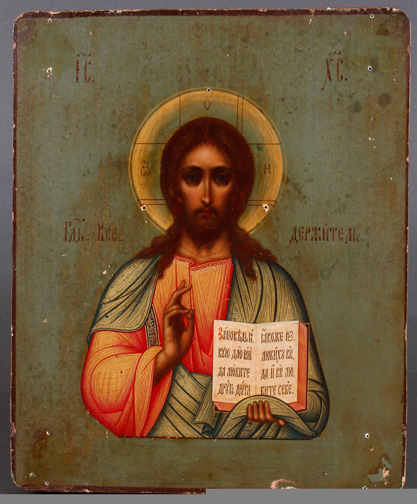
Earlier icons often had ornamental metal covers that were actually nailed to the painted surface of the icon, which accounts for the many little holes one sees in so many early icons when the covers are removed to reveal the painting beneath. That may also have happened to more recent icons, as is visible on the icon of Jesus as The Lord Almighty (Gospod Vsederzhitel) seen below. Note the little holes here and there on the surface:
(Photo Courtesy of Jacksonsauction.com)
That is a very quick summary of the way icons were commonly painted.
As for the paints themselves, they consisted of powdered plant and mineral and various organic substances. The colored powder was mixed with the yolk of an egg and a little rye beer (kvass) to keep it from quickly spoiling. Such paints are called “egg tempera,” and they are essentially the same kinds of paints that were used in Western European painting prior to the discovery of oil paints. In Russia, however, the use of egg tempera in painting icons continued right into the 20th century (and even today), while the use of oil paints in Russian icon painting was much less common, and is likely to be found in some later icons.
Of course individual painters had their own preferences and personal approaches.
To actually see these principles in action, here is a link to a video of an icon painter using а version of the otborka method for the Archangel Michael:
And here is a painter using the plav’ technique to paint the face of Nikolai Chudotvorets — “Nicholas the Wonderworker.” The audio is in Russian, but one can easily follow visually as he applies lighter layers of color to the initial dark sankir base color:
Here is a link to a video showing the modern creation of an icon for an iconostasis from raw wood to finished image:
If you found this article interesting, you may wish to read these as well: